Quick Answer: How Do You Read Forex Charts?
Reading a forex chart begins with selecting a chart type (line, bar, or candlestick), choosing your time frame, and then interpreting price movements through structured patterns. Candlestick charts are the most widely used by professional traders because each candle visually encodes four critical pieces of information: the opening price, the highest price reached, the lowest price reached, and the closing price during any given time period. Recognizing repeating candlestick patterns gives traders probabilistic clues about where price is likely to move next.
Introduction
- Quick Answer: How Do You Read Forex Charts?
- Introduction
- What Is a Forex Chart and Why Does It Matter?
- The 3 Types of Forex Charts
- Line Charts
- Bar Charts (OHLC Charts)
- Candlestick Charts
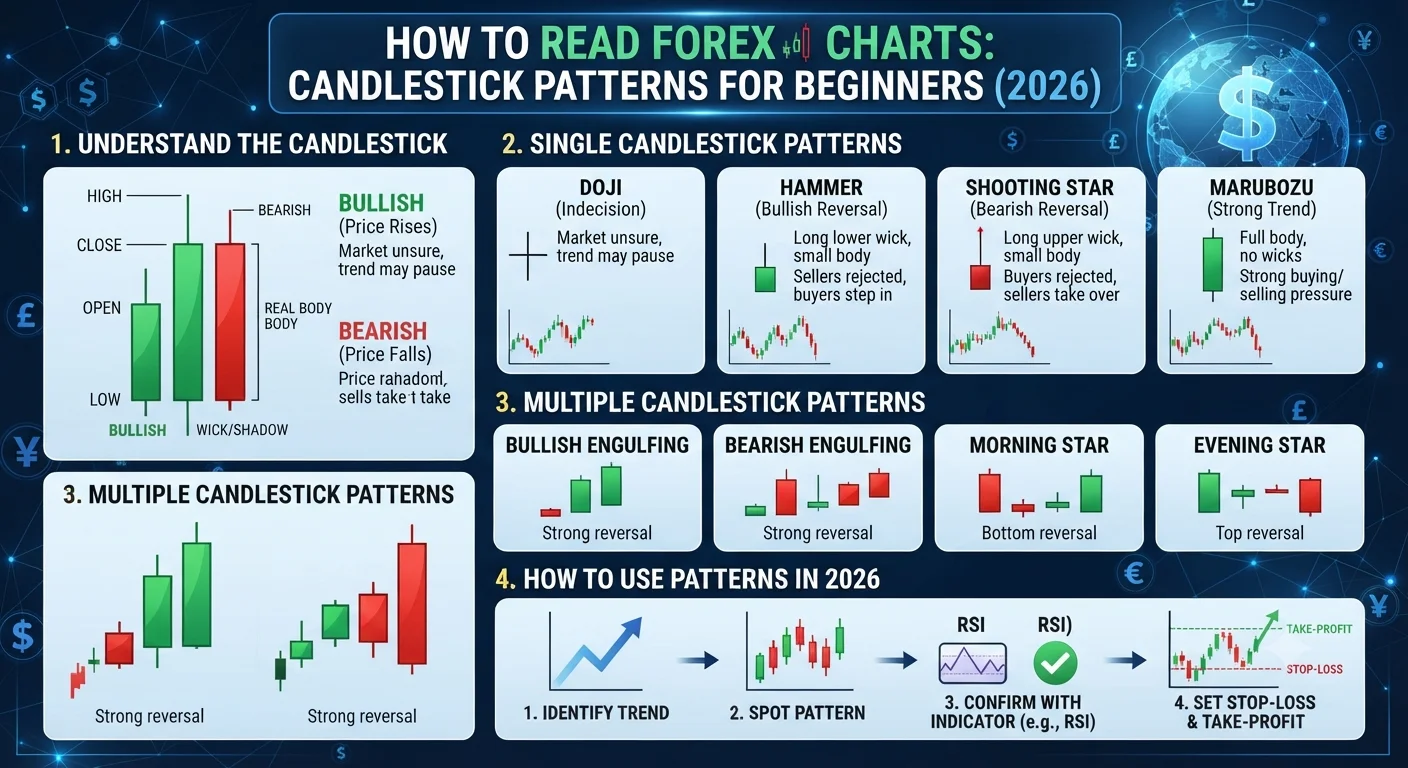
- How to Read a Candlestick: Open, High, Low, Close
- The 10 Most Powerful Candlestick Patterns in 2026
- 1. The Doji: The Indecision Signal
- 2. Hammer and Hanging Man: Trend Reversal Signals
- 3. Bullish and Bearish Engulfing Patterns
- 4. Morning Star and Evening Star
- 5. Shooting Star: Bearish Rejection at Resistance
- 6. Piercing Line and Dark Cloud Cover
- 7. Three White Soldiers and Three Black Crows
- 8. Spinning Top: Weakening Momentum
- 9. Bullish and Bearish Harami
- 10. Marubozu: Pure Momentum Candles
- How to Combine Candlestick Patterns With Support and Resistance
- Key Takeaways
- Frequently Asked Questions
Every trade a forex trader ever makes is based on one core question: where is price going next? The answer to that question is found in charts.
A forex chart is a visual record of price history. It shows exactly what buyers and sellers have done in the market over any chosen time period. For a beginner, looking at a price chart for the first time can feel like staring at a foreign language. But chart reading follows a clear, learnable structure, and once you understand the fundamental logic, patterns that previously looked like noise begin to reveal meaningful information.
The Japanese rice trader Munehisa Homma is widely credited with developing candlestick charting techniques in the 18th century to track rice futures prices at the Dojima Rice Exchange in Osaka. His methods were formalized in the West by technical analyst Steve Nison, whose 1991 book "Japanese Candlestick Charting Techniques" introduced the approach to modern financial markets. Today, candlestick charts are the default format on virtually every professional trading platform in the world.
This guide teaches you how to read all three major chart types, how to decode individual candlesticks, and how to identify the ten most powerful candlestick patterns that traders rely on in 2026.
What Is a Forex Chart and Why Does It Matter?
A forex chart is a graphical representation of a currency pair's price movement over time. The horizontal axis shows time, and the vertical axis shows price. Every movement you see on the chart reflects the aggregate result of millions of buy and sell decisions made by traders, institutions, central banks, and corporations around the world.
Charts matter because they reveal patterns in human behavior. Markets are driven by the emotions and decisions of their participants, and those emotions leave traceable marks in price data. Fear pushes prices down sharply. Greed drives them up aggressively. Uncertainty produces choppy, directionless movement. Technical analysis is the study of these patterns, built on the premise that historical price behavior tends to repeat itself because human psychology does not fundamentally change.
The time frame you select determines how much history each individual unit on the chart represents. A one-minute chart shows 60 seconds of trading activity per candle. A daily chart shows one full trading day per candle. A monthly chart compresses an entire month into a single visual unit. Short-term traders (scalpers and day traders) primarily use one-minute to one-hour charts. Swing traders focus on four-hour and daily charts. Long-term investors may use weekly or monthly charts.
The 3 Types of Forex Charts
Line Charts
A line chart is the simplest form of forex chart. It plots a single data point for each time period, almost always the closing price, and connects those points with a continuous line. This produces a clean, easily readable representation of the overall direction of price over time.
Line charts are useful for identifying the broad trend at a glance and are often used for long-term analysis where the fine details of individual price bars are less important than the overall directional movement. Their limitation is that they discard the opening price, the high, and the low for each period, losing a substantial amount of potentially useful information.
Bar Charts (OHLC Charts)
A bar chart, also known as an OHLC chart (Open, High, Low, Close), represents each time period as a vertical bar with two small horizontal dashes extending from it. The top of the vertical bar shows the period's highest price. The bottom shows the lowest price. The small horizontal dash on the left side of the bar shows the opening price, and the dash on the right shows the closing price.
Bar charts contain all four essential data points for each time period and were the dominant chart type used by Western traders before candlestick charts became widely adopted. Many experienced technical analysts still use bar charts and find them highly effective. The visual distinction between bull bars (where the close is above the open) and bear bars (where the close is below the open) is less immediately intuitive than with candlesticks.
Candlestick Charts
Candlestick charts present the same OHLC data as bar charts but in a visually superior format that makes patterns far easier to identify quickly. Each time period is represented as a "candle" with a rectangular body and thin lines called wicks (also called shadows or tails) extending from the top and bottom.
- How Does the Foreign Exchange Market Work? Full Structure Explained (2026)
- What Is Forex Trading? A Complete Beginners Guide for 2026
The body of the candle represents the range between the opening and closing price. If the close is higher than the open (a bullish or rising candle), the body is typically displayed in green or white. If the close is lower than the open (a bearish or falling candle), the body is typically displayed in red or black.
The upper wick extends from the top of the body to the highest price reached during the period. The lower wick extends from the bottom of the body to the lowest price reached. The length of the wicks relative to the body conveys critical information about the battle between buyers and sellers during that time period.
Candlestick charts are the professional standard in 2026. All major trading platforms including MetaTrader 4, MetaTrader 5, TradingView, and cTrader default to candlestick charts, and the vast majority of technical analysis literature and trading education uses candlestick format.
How to Read a Candlestick: Open, High, Low, Close
Understanding how to decode a single candlestick is the essential foundation before studying patterns. Each candle tells a complete story of the struggle between buyers (bulls) and sellers (bears) during its time period.
Consider a bullish (green) one-hour candlestick on the EUR/USD chart:
The candle opened at 1.0850 when the hour began. Sellers initially pushed the price down to 1.0835 (this level becomes the bottom of the lower wick). Buyers then took control, pushing price all the way up to 1.0880 (this level becomes the top of the upper wick). The hour closed at 1.0870. The body of the candle therefore spans from 1.0850 (open, bottom of body) to 1.0870 (close, top of body).
What does this candle tell a trader? Buyers dominated the session. Despite an initial dip, bulls recovered strongly and pushed price well above the opening level. The relatively short upper wick suggests buyers maintained control near the close without excessive selling pressure from above. This is a moderately bullish candle.
Now consider a bearish (red) candle that opened at 1.0870, rose briefly to 1.0885 (upper wick), fell to 1.0820 (lower wick), and closed at 1.0830. The body spans from 1.0870 (open, top of body) to 1.0830 (close, bottom of body). Sellers dominated this session. The brief rise to 1.0885 was rejected, and price fell significantly before closing near the lows of the period. This is a strong bearish candle.
Reading individual candles this way, as a record of the battle between buyers and sellers, is the foundation of all candlestick analysis.
The 10 Most Powerful Candlestick Patterns in 2026
Candlestick patterns fall into two broad categories: single-candle patterns, which are formed by the shape of one individual candle, and multi-candle patterns, which require two or three consecutive candles to form. Both types work most reliably when they appear at significant price levels such as support, resistance, or major trend lines.
1. The Doji: The Indecision Signal
The Doji is formed when the opening and closing price of a candle are virtually identical, producing a candle with a very small body or no body at all. The wicks can extend substantially in both directions. The Doji visually represents a standoff between buyers and sellers: neither side was able to establish dominance during the period.
A Doji appearing after a prolonged uptrend signals that buying momentum may be exhausting. A Doji appearing after a prolonged downtrend signals that selling pressure may be weakening. In isolation, a Doji is not a strong signal. Its significance is amplified when it appears at a key support or resistance level and is confirmed by the subsequent candle moving in the anticipated reversal direction.
There are several varieties of the Doji. The Long-Legged Doji has long wicks extending in both directions, indicating exceptional uncertainty. The Gravestone Doji has a long upper wick and no lower wick, suggesting buyers pushed price up strongly but sellers completely reversed the move by the close, which is a bearish signal. The Dragonfly Doji is the mirror image, with a long lower wick and no upper wick, suggesting sellers pushed price down but buyers completely recovered the losses by the close, which is a bullish signal.
2. Hammer and Hanging Man: Trend Reversal Signals
The Hammer and the Hanging Man are physically identical candlesticks: a small body near the top of the candle's range with a long lower wick that is at least twice the length of the body, and little to no upper wick. Their significance depends entirely on where they appear in the context of the preceding trend.
A Hammer appears at the bottom of a downtrend and signals a potential bullish reversal. The long lower wick tells the story: sellers pushed price down aggressively during the session, but buyers stepped in forcefully and drove price back up to close near the opening level. This rejection of lower prices suggests buyers are gaining strength. A Hammer is most significant when it appears at a known support level and when the following candle closes above the Hammer's body.
A Hanging Man appears at the top of an uptrend and carries a bearish implication. Despite the same visual structure as a Hammer, the Hanging Man appears after price has risen significantly. It signals that sellers were briefly able to overwhelm buyers and push price sharply lower before the recovery, suggesting that bearish pressure is building beneath the surface of an uptrend.
3. Bullish and Bearish Engulfing Patterns
Engulfing patterns are two-candle formations and among the most powerful reversal signals in candlestick analysis. They are called engulfing because the body of the second candle completely engulfs (is larger than) the body of the first candle.
A Bullish Engulfing Pattern consists of a small bearish candle followed by a larger bullish candle whose body fully covers the body of the first candle. It appears at the end of a downtrend and signals that buyers have overwhelmed sellers decisively. The larger the bullish candle relative to the preceding bearish candle, the more powerful the signal.
A Bearish Engulfing Pattern is the mirror image: a small bullish candle followed by a larger bearish candle that fully engulfs it. It appears at the top of an uptrend and signals that sellers have taken control from buyers. This is one of the most watched patterns by professional traders because it frequently marks significant swing highs and the beginning of meaningful downward moves.
Recommended Articles
 FOREX TRADING BASICS
 FOREX TRADING BASICS
 FOREX TRADING BASICS
 FOREX TRADING BASICS
4. Morning Star and Evening Star
These are three-candle patterns that signal major trend reversals and are considered among the most reliable formations in candlestick analysis.
The Morning Star appears at the bottom of a downtrend. The first candle is a large bearish candle, confirming the existing downtrend. The second candle is a small-bodied candle (sometimes a Doji) that gaps slightly lower, representing indecision at the potential turning point. The third candle is a large bullish candle that closes well into the body of the first candle, confirming that buyers have taken decisive control. The morning star pattern, as its name implies, signals the end of darkness (the downtrend) and the beginning of a new day (an uptrend).
The Evening Star is the bearish counterpart, appearing at the top of an uptrend. The first candle is a large bullish candle. The second is a small-bodied candle representing uncertainty at the peak. The third is a large bearish candle confirming the reversal. This three-candle sequence has been documented in academic research as one of the highest-probability candlestick reversal patterns, particularly when it appears at a significant resistance level.
5. Shooting Star: Bearish Rejection at Resistance
The Shooting Star is a single-candle pattern that forms after an uptrend. It has a small body near the bottom of the candle's range, a long upper wick that is at least twice the body length, and little to no lower wick. The long upper wick tells the story: buyers pushed price significantly higher during the session, but sellers overwhelmed them and pushed price all the way back down to close near the opening level.
This pattern represents a decisive rejection of higher prices. The Shooting Star is most powerful when it appears near a significant resistance level, when the upper wick protrudes clearly above recent highs, and when the following candle confirms the reversal by closing lower.
6. Piercing Line and Dark Cloud Cover
The Piercing Line is a two-candle bullish reversal pattern. The first candle is bearish and confirms the existing downtrend. The second candle opens below the previous candle's low (often with a gap down in markets where gaps occur), then rallies strongly to close above the midpoint of the first candle's body. This strong intraday reversal signals significant buying interest at these price levels.
The Dark Cloud Cover is the bearish mirror image. A bullish candle is followed by a candle that opens above the previous high but closes below the midpoint of the bullish candle's body. This pattern signals that sellers entered aggressively at the new highs and successfully pushed price back below the equilibrium point, indicating bearish intent.
7. Three White Soldiers and Three Black Crows
These are three-candle continuation and confirmation patterns that signal strong directional momentum.
Three White Soldiers consists of three consecutive bullish candles, each opening within or near the previous candle's body and closing progressively higher with relatively small wicks. This pattern confirms strong, orderly buying pressure and is often seen at the beginning of significant uptrends or after a period of consolidation following a bullish reversal.
Three Black Crows is the bearish equivalent: three consecutive bearish candles with small wicks, each closing progressively lower. This pattern confirms sustained selling pressure and often appears at the beginning of meaningful downtrends.
8. Spinning Top: Weakening Momentum
A Spinning Top has a small body (either bullish or bearish) with wicks extending in both directions of roughly equal length. Unlike the Doji, the body is more pronounced, but the equal-length wicks still indicate balance between buyers and sellers.
The Spinning Top signals that the current trend is losing momentum. Buyers and sellers reached rough equilibrium during the period. Appearing within an uptrend, it suggests bulls are losing their dominance. Within a downtrend, it suggests bears may be exhausting themselves. It requires confirmation from subsequent candles to provide a reliable signal.
9. Bullish and Bearish Harami
The word "harami" means pregnant in Japanese, which describes the visual structure of this two-candle pattern: a large candle followed by a smaller candle whose body is completely contained within the body of the first candle.
A Bullish Harami consists of a large bearish candle followed by a smaller bullish candle contained within the first candle's body. The containment of the second candle within the first suggests that the powerful selling pressure of the first candle has not continued with equal force, raising the possibility of a trend reversal.
A Bearish Harami is the reverse: a large bullish candle followed by a smaller bearish candle contained within it. It signals that the bullish momentum that produced the large first candle has stalled. Like all single and two-candle patterns, the Harami requires context and confirmation to be actionable.
10. Marubozu: Pure Momentum Candles
A Marubozu is a candle with no wicks at all, meaning the price opened at one extreme of its range and closed at the opposite extreme without any reversal during the period. A bullish Marubozu opens at the period's low and closes at the period's high. A bearish Marubozu opens at the period's high and closes at the period's low.
The Marubozu represents the most complete possible victory for one side of the market during a given period. Buyers or sellers were so dominant that price never even briefly moved against the prevailing direction. These candles signal powerful directional conviction and often appear at the beginning of strong trends or during the acceleration phase of an existing trend.
How to Combine Candlestick Patterns With Support and Resistance
Candlestick patterns do not work in isolation. A Doji or Hammer appearing in the middle of a price range with no structural significance is far less meaningful than the same pattern appearing exactly at a well-established support or resistance level that has held price multiple times in the past.
The most effective way to use candlestick patterns in 2026 is as confirmation tools that validate what the underlying market structure is already suggesting. If price has pulled back to a major support level, the area is already under scrutiny from buyers. A bullish candlestick pattern appearing at that support gives you a confirmed signal that buyers are defending the level, adding a significant layer of evidence to your trade thesis.
A practical framework for combining candlestick patterns with market structure:
- Identify significant support and resistance levels on the daily or four-hour chart by marking price levels where the market has reversed multiple times previously.
- Wait for price to reach one of these levels.
- Watch for a candlestick pattern to form at the level that is consistent with a reversal in the direction you anticipate.
- Look for additional confirmation: increasing volume, a moving average providing dynamic support, or an RSI reading at an extreme that supports the reversal thesis.
- Enter the trade only after the confirming candle closes, never in anticipation of the pattern completing.
This approach filters out the majority of low-probability pattern setups and focuses your attention on the situations where multiple factors align in the same direction.
Key Takeaways
- Candlestick charts are the professional standard for forex analysis because they display all four essential price data points (open, high, low, close) in an immediately readable visual format.
- Every candlestick tells a story about the balance of power between buyers and sellers during a given time period. The body size, wick length, and candle color all contain meaningful information.
- The most powerful candlestick patterns include the Hammer, Engulfing Pattern, Morning and Evening Star, and Shooting Star, all of which signal potential trend reversals.
- Candlestick patterns gain their greatest reliability when they appear at significant support or resistance levels, not at random points within a price range.
- No candlestick pattern provides certainty. They are probabilistic signals that require confirmation from subsequent price action before being acted upon.
- Time frame selection is critical: the same pattern on a daily chart carries more significance than on a one-minute chart, because it reflects a longer period of market behavior.
Frequently Asked Questions
What is the most reliable candlestick pattern for beginners? The Bullish and Bearish Engulfing patterns are widely considered the most reliable for beginners because they are visually straightforward to identify, appear frequently across all time frames and currency pairs, and carry a clear, unambiguous directional message. Their reliability increases substantially when they appear at known support or resistance levels and when their bodies are significantly larger than the candle they engulf.
Do candlestick patterns work in forex? Yes, candlestick patterns work in forex and are used extensively by retail and institutional traders alike. They work because they reflect genuine patterns in market behavior driven by human psychology, which is consistent across markets. However, they are not infallible signals. No technical pattern produces profitable results every time it appears. The goal is to use patterns as one component of a broader analysis framework that includes market structure, trend identification, and other technical or fundamental factors.
What time frame should beginners use for candlestick analysis? Beginners are generally best served by starting with the daily and four-hour charts. These time frames filter out the majority of random, low-significance price noise that clutters shorter charts, making patterns cleaner and more significant. Once you can consistently identify and interpret patterns on these higher time frames, you can incorporate shorter time frames to refine entry timing.
How many candlestick patterns do I need to learn? You do not need to memorize dozens of candlestick patterns to trade effectively. Many professional traders focus on mastering five to eight core patterns and develop deep expertise in identifying them correctly in varying market conditions. Knowing a few patterns extremely well, including understanding their failure conditions, outperforms knowing many patterns superficially.
Can I use candlestick patterns alone to trade forex? Using candlestick patterns alone, without any additional context such as trend identification, support and resistance levels, or other confirmation tools, produces significantly lower win rates than combining them with a broader analytical framework. Candlestick patterns are most powerful as confirmation signals within a complete trading strategy, not as standalone entry triggers.
What is the difference between a Doji and a Spinning Top? Both the Doji and the Spinning Top indicate market indecision, but they differ in the size of their bodies. A Doji has a nearly nonexistent body where the open and close are virtually the same price. A Spinning Top has a small but visible body, meaning there was some directional movement between the open and close, just not a dominant one relative to the total range. The Doji is generally considered the stronger indecision signal because the complete stalemate between buyers and sellers is more pronounced.
RISK DISCLAIMER: Forex trading involves substantial risk of loss. Candlestick patterns are technical analysis tools intended for educational purposes and do not guarantee profitable trading outcomes. This article does not constitute financial advice. Always implement proper risk management and consult a qualified financial professional before trading.